They say a picture is worth a thousand words, right? Well, in the online world, it’s worth millions. Literally. When you successfully design social media graphics, you can easily capture people’s attention, share your message, engage with your customers, increase your leads and conversions, and improve your brand experience. That’s why in this day and age, it’s essential to have great visual content.
However, not everyone is a skilled designer. And not all businesses have the resources to employ a professional designer. That’s where Canva can help.
As you may already know, Canva is a leading graphic design platform that enables users to create social media graphics, presentations, posters, and a whole lot more with its ready-made layouts. Mastering logo design with canva is a super power. It provides options for images, filters, icons and shapes, and fonts – essentially everything you will need for an amazing design.
To help you maximize their features, we’re uncovering nine ways you can create eye-catching social media graphics using Canva.
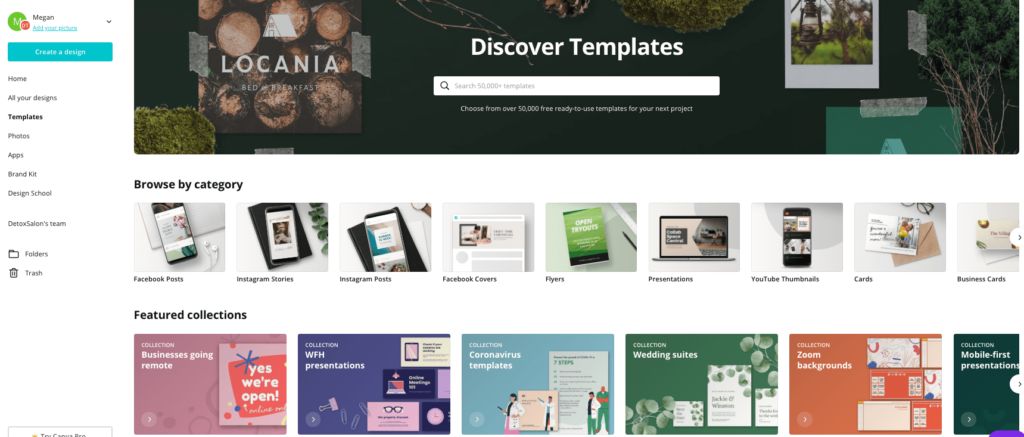
Browse Canva's Many Free Templates
Before you begin creating, it’s important to identify your content goals, the social channels you’ll use, and the important details that will go into your design. Understanding what you want to achieve and having a content strategy in place will help you curate more relevant and well-thought graphics.
Canva has a wide array of professionally-made templates and elements that you can simply choose from to see which ones best fit your strategy. If you have Canva Pro, you can access everything for free. Alternatively, if you’re on the free version, take time to browse through the templates library and see all the available features before deciding if there’s something you want to purchase.

If you’re still unsure of how to start (or you have creative blocks), check out Canva’s Design Inspiration for creative ideas from great designs across the web. It’s also helpful to have a mood board where you can put together different color palettes, themes, images, and other visual pieces and identify which are appropriate for your project.
Stick With Colors That Are Consistent With Your Branding
With a variety of options, it’s challenging to decidehow to create a distinctive style. One way to do it is to use colors that areclosely related to existing branding.
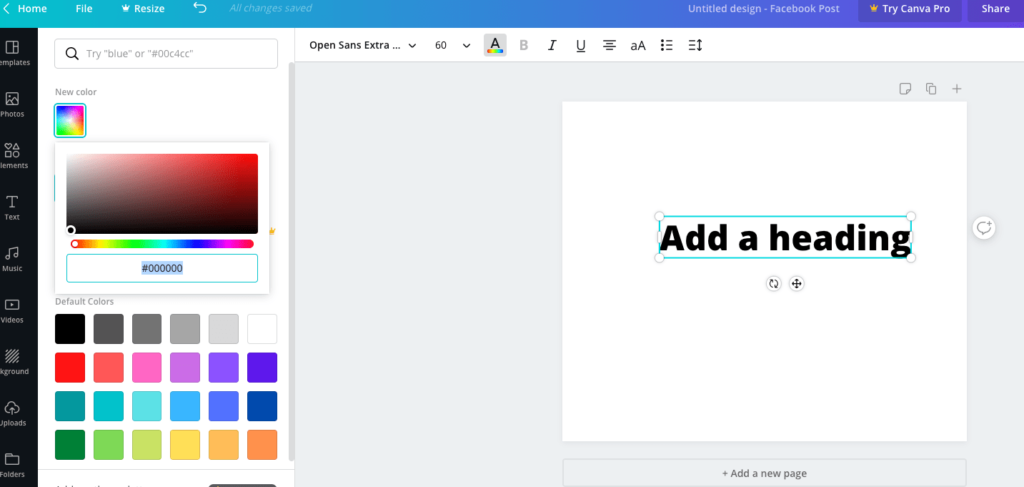
On Canva’s basic color picker, you’re first shown eight primary colors. But, through the button on the lower right (circle with a plus sign), you can access a larger color palette that allows you to manually input your color hex codes that match your corporate branding.

Though it’s not mandatory to use the exact samecolors, using similar ones across your posts in all channels can help you standout and become recognizable online. This means that even if people see yourgraphics without any identifier, they can instantly know that it’s your design.Remember, your social feeds are extensions of your business, so you’ll want touse these to foster visual recognition and brand loyalty.
Essentially, having consistent colors gives identity and cohesion to your branding. It enables people to immediately recognize you regardless of where they are browsing online.
Bonus Tip: Use Canva’s Color Wheel to see what colors look good together.
Choose Your Fonts Wisely
Fonts are another important aspect of your socialmedia graphics because they give out different tones and personalities. That’swhy it’s essential to try out different font styles to see what best fits yourlayout.
A good place to start is to use fonts that are close to your existing marketing pieces. Canva, however, only offers about 100+ fonts, so some business typefaces may be unavailable and you might need to do font pairing.
If you want to experiment, make sure to use only oneor two fonts at a time. Pair those that create good contrast but complementeach other. As a rule of thumb, never use more than two fonts in one design. It’sbetter to apply one font family and use their variants – italic, bold, orcondensed – to create visual uniformity.
More importantly, use texts that are legible and easy to read to create effective social media graphics. Applying several different fonts may make it too hard for the audience to consume your content.
Include Your Website URL or Social Handles Within the Image
Give your audience easier access to your pages by positioning their links close to the image. Make sure the URL texts have sufficient contrast against the design’s background color so that it’s clear and readable. Alternatively, place a rectangular layer between the link and the image and add in some transparency. This will provide a visible position for your web addresses without blocking or disrupting the image behind it.
Bonus Tip: Another subtle branding option is to add yourlogo in a consistent location of each image. Just make sure it follows anycorporate guidelines you may have.
Use High-Quality and Relevant Images
To create engaging content, use photos that can catch people’s attention in an instant. For example, studies show that images with dogs and smiling people tend to perform better, so you might want to consider having your staff members (or your pets!) as the subjects of your photos. Also, posts with contrasting colors often convert higher on social.
Essentially, having excellent visual content will keep people interested, so investing in thoughtful aesthetics goes a long way.
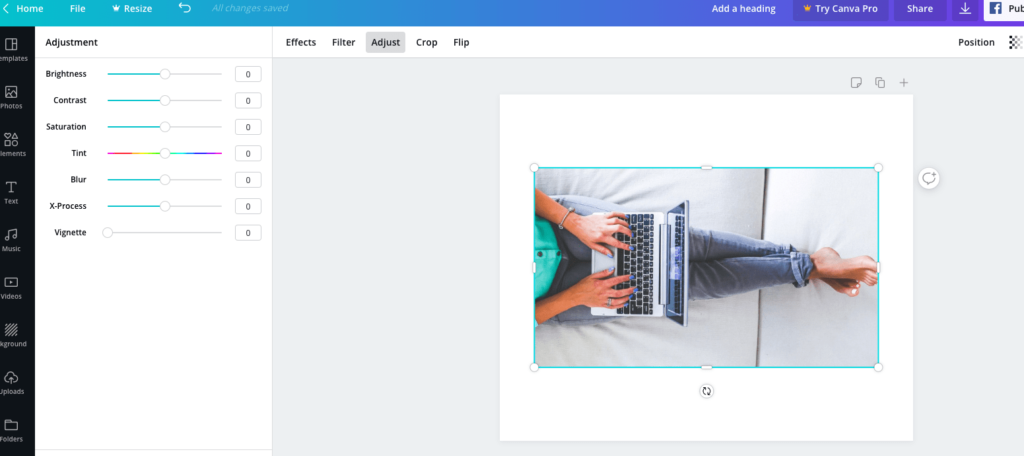
If the colors of your photos don’t make the cut, perhaps because of lighting, use Canva’s photo adjustment feature to tweak your pictures as suitable for your design. From brightness, contrast, and saturation to tint, you can play around the settings to get the graphics you desire.

You can also use their filters to easily change thetone of your images. Applying custom filters in your posts creates a uniformtheme that helps tie together all elements of your design.
Bonus Tip: Whatever image you use, make sure they’reapplicable to the message you’re trying to convey and that they match with yourdesign color and fonts. Again, consistency is essential here.
Resize and Optimize for Each Platform
As a marketer, you know how vital it is to post content that fits each channel’s unique requirements. Gone are the days when you have to manually crop (or worse, expand) your design only for it to end up looking terrible and having to start all over again. Canva has made it extremely easy to do this!
For Canva Pro users, you can fit Instagram posts into Facebook, Pinterest, and Twitter in just a few clicks using the “Magic Resize” feature. This time-saving feature lets you copy and resize your designs to fit each platform’s formats.
If you’re using the free version, you can still optimize your designs by creating a copy of the original material. Then, click “File,” “Change Dimensions,” and choose the format you’d like to resize the design to fit. You may have to do a few manual adjustments, but it’s a lot better that having to start all over again.
Don’t Be Afraid to Experiment
Canva provides a ton of features that can make your designs stand out, so your task is to have fun when creating social media graphics that will grab the audience’s attentions and make them easily understand your message.
Here are some tips you can try:
- Use frames or borders to add a solid line to your text. This helps draw attention to the message while providing an elevated vibe to your design.
- Use lines to emphasize the words you want to stress or to provide balance and proportion with other design elements.
- Use shapes to draw attention to certain words or images. Add in a bit of transparency so the background will not be totally covered (just like when you’re adding your URLs).
- Use contrasting color palette backgrounds, fonts, or graphics. Light-colored backgrounds should use a dark font and vice versa.
... But Keep it Clean and Simple
Even if you have creative freedom (and many different features to work with), it doesn’t mean should use all of them together. It’s still important to know your limits and focus on creating a clean and cohesive design.
Make sure all the elements you put into your social media graphics are supposed to be there – aligned, evenly distributed, and properly formatted. Keep the colors, typefaces, shapes, lines, and frames to a minimum. For example, if you’re already working with a strong image, let the picture do the talking and avoid adding too many design elements. Also, use sharp lines and symmetrical designs to create uncluttered designs.
Keep in mind that your posts are supposed to drawpeople in, so your designs should be attractive, compelling, and powerfulenough to get their attention.
Sign Up for Canva’s Free Online Courses
You’re finally creating amazing social media graphics. Great job! But the learning doesn’t stop there. If you want to know more, Canva’s Design School is here for you.
It’s a resource hub for the basics of design,including branding, design essentials, photo editing, presentation tips, andvarious typographies. You can even track and share your progress when younavigate through the lessons. It’s the perfect partner for your creative journey.
Start Designing With Canva – Today!
Whether you’re a beginner or a seasoned designer, these nine simple, actionable, and highly effective tips can help you create eye-caching social media graphics. Canva has made it so much easier for everyone – even those who think they don’t have a creative bone in them – to come up with stunning and engaging content. You just have to take advantage of all the features they’re offering.
We know that you’ll want your designs to be the best possible reflection of your brand. Everyone does. But to get to that, know that you will make mistakes along the way. And that’s totally okay. Much like everything in business, designing is all about trial and error. It's an ever-evolving learning process. What’s important is that you learn to absorb feedback, keep designing, and pivot your direction to come up with better and more impactful social media graphics over time.
Did you know that Canva easily integrates with e-clincher? Not only does it allow you to apply all these tips we’ve shared, but it simplifies all of your content creation and publishing processes.
.svg)
.svg)
.svg)
.svg)

.svg)
.svg)
.svg)

.svg)

.svg)
.svg)

.svg)


.svg)
.svg)
.svg)
.svg)

.svg)


.png)
%20(1).png)
.png)


.svg)
.svg)
.svg)

.png)
.png)
.png)
.svg)
.svg)
%20(1).png)
.svg)
.png)


.png)
.svg)
.svg)
.svg)
%20(1).png)
.png)
.png)

.png)
.png)
.svg)
.svg)
%20(1).png)
%20(1).png)
.png)

%20%20-%20%201296x600px.png)


